Your brand, as we currently read it.
This is not a brand you commissioned from us, and it is not a critique. It is our working understanding, assembled from your logo file, your live site and your own words — written down so you can correct it before we design anything.
Every item is labelled. Some things you clearly own. Some have never been written down. A few are suggestions of ours, and they are marked as such so you can reject them cleanly.
How to read the labels
Measured or quoted directly from something you already own. Fact, not opinion.
We could not find it. It may exist in a file we have not seen — tell us if so.
Our suggestion, used in the sample site. Yours to accept or throw out.
One
The logo
The strongest thing you own, and the source of everything else here.
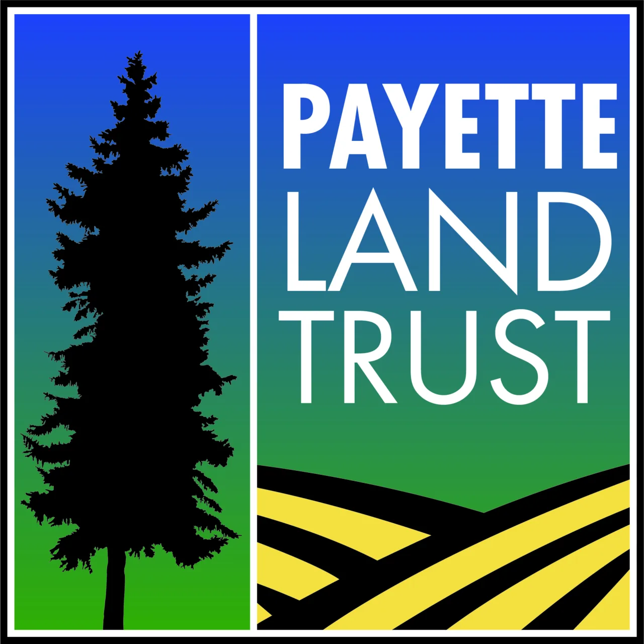
- A square badge. Left panel carries a conifer silhouette; right panel carries the wordmark over contour-ploughed field lines.
- Background is a continuous vertical gradient, sky blue at the top through to meadow green at the bottom.
- Wordmark is set in bold condensed capitals, stacked on three lines, in white.
- Source file is an Adobe Illustrator EPS, 458×458pt, CMYK, created December 2021.
- There is no horizontal lockup. The square badge is the only version that exists. That is the single biggest practical gap — a wide website header, an email signature and a document footer all want a horizontal mark.
- No stated clear-space rule, minimum size, or one-colour/reversed version.
- No guidance on the badge over photographs.
What this forced in the sample site
Because the badge is square and its wordmark sits inside the artwork, it has to be physically large before the words “Payette Land Trust” become readable. We ended up running it at 104px in the site header, which is larger than a header logo normally sits. A horizontal lockup would solve this properly and is worth commissioning whatever else you decide.
Two
Colour
No palette has been documented, so we sampled your logo directly. These are measured pixel values, not approximations.
Sky blue
#1E4BE6
Top of the gradient
Mid blue
#247094
Upper gradient
Teal
#257C7A
Gradient midpoint
Meadow green
#2CA51A
Base of the gradient
Field gold
#F4E13F
Contour field lines
Black
#000000
Conifer silhouette
The gradient, as it runs
- No brand palette document exists that we can find.
- The current website’s colours come from its Divi theme defaults, not from the logo.
- No CMYK or Pantone equivalents recorded for print.
- No accessible text/background pairings established.
We took the gradient’s two ends and gave them separate jobs rather than reusing the gradient itself, which reads as dated on screen and fights your photography. Green is land, blue is action, gold is the measure of it.
#0E1A17
Text
#16342C
Dark surface
#7E9285
Borders
#F2F0E9
Page
#D8A319
Figures
#2F6FA8
Buttons
The logo stays exactly as it is. It sits on these colours as an accent.
Three
Typefaces
This is the clearest gap. Your current site loads four unrelated fonts, none of them chosen.
| Open Sans | Divi default |
| Actor | Divi default |
| Didact Gothic | Divi default |
| Source Sans Pro | Divi default |
Four sans-serifs doing overlapping jobs. Nothing distinguishes a heading from a caption except size.
- No typeface is specified for the brand, only whatever the theme shipped with.
- The logo’s own lettering has not been identified or licensed as a text face.
- No type scale, weights or line-height conventions.
Three faces, each with one job. All are free and open-licensed, so there is nothing to renew.
Headlines
Land that stays land
Archivo, wide and bold — echoes the logo’s capitals.
Body
A conservation easement retires the right to develop your ground — permanently, in a deed filed at the county courthouse.
Newsreader — a reading serif. Reads as a written document rather than a brochure.
Data & labels
VALLEY COUNTY · 1,240 ACRES
IBM Plex Mono — acreage, counties, legal descriptions.
Four
Voice
You already write well. This is the one area needing least work.
Observed — your mission statement, quoted exactly
“Payette Land Trust is dedicated to conserving the rural landscapes of West Central Idaho to benefit our communities; protecting the scenic, agricultural, recreational, historic, and wildlife character of the region.”
Specific, unhurried, no jargon. It is strong enough to carry a homepage unedited, which is how we used it in the sample.
- You name places precisely — Valley, Adams, Idaho and Washington counties; the North Fork; Peterson Forest.
- Your framing is community-first: land protected “to benefit our communities”.
- Existing series titles have real character — Voices from the Land, Hunt for the Heart.
- No written tone guidance, so consistency depends on who is typing.
- No agreed shorthand: “PLT” and “Payette Land Trust” are used interchangeably.
- No standing description of what a conservation easement is, so it gets re-explained differently each time.
Two audiences read your site for opposite reasons, and one rule serves both: say the concrete thing. Landowners want to know what they keep and what they give up. Donors want to know the protection is real. Neither is persuaded by adjectives.
Rather this
“You keep the land. The right to subdivide it is retired for good.”
Than this
“We are committed to leveraging innovative conservation solutions for a sustainable future.”
Five
Photography
An asset you are currently under-using.
- A real library on your current site: working barns, the Payette braiding through pasture, snow on the high ridge, wildflower pasture, children on conserved ground.
- It is your own country, not stock. That is rare and immediately obvious to a reader.
- Currently displayed small, at roughly 400px wide in places.
The sample site uses these photographs at full width and with almost no colour treatment, which is the single biggest visual change from your current site.
- Rights are unconfirmed. We would need to know these are yours to publish, or who took them, before launch.
- No captions, dates or locations recorded against most images.
- No guidance on cropping, treatment or when a photograph needs an overlay for text.
- No consistent naming, which makes finding the right image slow.
Six
To turn this into a real brand guide
None of these are large jobs. Together they are the difference between a brand and a logo.
| What | Why it matters | Who |
|---|---|---|
| A horizontal logo lockup | Website headers, email signatures and letterheads all need one. The square badge cannot do this job. | Designer |
| Confirmed colour values | Our figures are sampled from a compressed image. Your EPS holds the authoritative CMYK values. | You / designer |
| A decision on typefaces | Ends the four-font situation and makes every future document consistent. | You, with us |
| Photography rights confirmed | Needed before launch. Also determines whether we can crop and reuse freely. | You |
| The facts we are missing | Acres protected, year founded, easement count, staff list. Currently blank in the sample. | You |
| One page of tone guidance | So anyone on staff can write for the site and sound like the same organisation. | Us, for your approval |
If we have this wrong
Tell us. Everything above is inference from public material, and a brand file we have not seen would change several sections. Corrections are more useful to us than agreement.